research
User-Centered Liquid Staking
Initial UX evaluation of Lido.fi, the leading decentralised protocol for Ethereum liquid staking
As an experiment, I have performed a heuristic evaluation and applied some methods borrowed from product development to look at how Lido.fi staking widget’s UX can be improved. It's exciting to explore how Web3 apps can be made more user-friendly while still maintaining the technical complexity.
The audit provided below is incomplete and has a limited scope. The Next Steps section contains an overview of the topics that could be covered in a comprehensive audit and the next steps for the staking widget product team. For now, we will just focus on:
- Staking user journey of one selected user persona;
- Ethereum Mainnet chain;
- Desktop version of the widget;
- Limited list of 1-2 ideas for improvement.
Audit Objectives
What?
Lido’s official ETH staking widget — a web3 app for staking, withdrawing and tracking rewards.
Why?
- Improve initial adoption among crypto enthusiasts and casual users → diversify the holders of the stETH token; increase the number of wallets that have interacted with a contract at least once; boost the conversion rate from visiting the widget for the first time to the first successful staking transaction.
- Build better trust around Lido protocol from the security and risks standpoint → increase and Lido’s market dominance
- Build a widget that is easy to use, yet provides enough flexibility and speed for power users → increase the restaking conversion rate; improve — customer retention rate.
In simple words: find ways to iterate on current staking widget’s UX to boost key business metrics.
These objectives are yet to be discussed with the internal stakeholders and are purely based on initial observations. The more detailed research requires conducting user interviews, gathering business analytics insights (using chain analytics and internal anonymised application analytics), A/B testing etc.
User Personas
We will start by defining groups of potential users of the app based on the similarity of their interests, values and behaviour. Some findings presented in this report will only be applicable to the specific persona. Understanding these user portraits will help implement improvements in a more efficient way.
Additionally, these personas might help data analysts building cohorts while gathering business metrics. For example,
$HIP and $DEG can have different re-staking conversion rates, hence this should be taken into account when interpreting results of an A/B test.
Crypto N00bs – $NUB
Close to zero prior crypto experience, do not hold a non-custodial wallet
not relevant for this research

Web3 Casuals – $HIP
Have small or moderate experience with Web3, hold one or a few non-custodial wallets, have not interacted with Lido before. Sub-personas based on their general knowledge of what staking etc. is.
Values: usability, transparency, aesthetics

Web3 Power Users & Degens – $DEG
Have advanced Web3 knowledge. Have been already using Lido alongside other DeFi products for quite a while. Hold more that one non-custodial wallets.
Values: speed, reliability, security

Institutions – $BIZ
Manage self-hosted institution wallets with advanced security. Multiple parties involved. Deep understanding of the protocol and intricacies associated with tax reporting.
Values: security, risk management, transparency
We can assume that the first group,
$NUB, represents the least significant portion of Lido users. While this segment has the potential to become a growth point in the future, onboarding these users is currently beyond the scope of the staking widget. This can be addressed by guiding them through the steps of creating their first wallet and purchasing ETH through external providers such as Moonpay, Onramper, Coinbase, etc. UI-wise this can be achieved via hints, empty states, top-level navigation links.
Customer Journey Map: Staking
CJMs help to visualise the steps a user has to go through to perform their “job” (a valuable action), and positive/negative emotions that they experience along the way.
Pain Points and Ideas
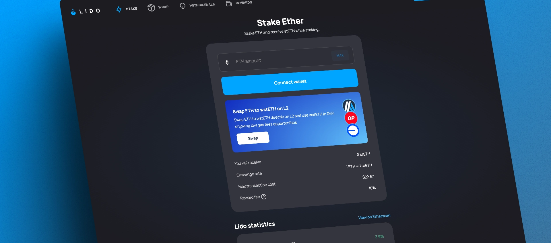
Priority of L2 Banners
PAIN-101 breaks the Visual Hierarchy principle by having two primary call-to-action elements with visually similar priority. However, on this step, the “Submit” (or “Stake”) button is presumably more important that the L2 offer, at least for
$HIP persona. We assume that the segment of users who want to stake, wrap and bridge their ETH is much smaller than the segment of those who just want to stake their ETH for the first time.Similarly in PAIN-304, the "Learn More" option is the only primary action in this dialog. However, there may be other important steps that a user can take after successful staking (like tracking rewards, re-staking, learning about withdrawals etc.)
Ideas
- Give the banner less focus and separate it visually from the staking widget.
- Simplify the initial offer by introducing a dedicated semi-static screen in the app → one key function per screen.
- Trigger non-blocking popups progressively, once specific action is performed: first swap is executed, or when an app is loaded for the first time. Allow these popups to be closed indefinitely or until the next visit, or after a specific time interval.
- Provide facts, proving why swapping on L2 could be beneficial. This could be: estimate amount saved on future transactions, a list of benefits of each network and how they differ from one another.
Entering the amount
PAIN-103, PAIN-201, PAIN-202 and PAIN-301 are less important inconsistencies in the UI that could affect the usability when
$HIP is entering the amount. PAIN-301 could use a better language to comply with “Consistency and Standards” heuristic: “Submit” → “Stake”.
PAIN-103 is about the Immediate Feedback that could be given to the user as their typing the amount. Currently, the label with the amount you receive (plus, the fees) is too far away from the input.
In PAIN-202, the comma symbol
, can’t be used as a decimal separator, even though there are at least 45 countries in the world where comma is used.In PAIN-201, a user is getting a negative feedback even though they haven’t typed anything yet.
The easiest solution would be to follow well-defined community standards: provide validation feedback in the CTA button and use better copywriting: “Connect Wallet” → “Enter amount to stake” → “Insufficient ETH balance” → “Stake” → “Approving…” → “Staking…”


Educating and explaining the risks
PAIN-102 and PAIN-203 are less specific discoveries describing the confusion that a user might have before actually submitting their first transaction. “Is the protocol safe enough? What are my risks and benefits here?”. Currently, this is done through the FAQ section located below the widget. However, all the items in the FAQ section have the same visual priority. As a result, users may not have enough time to skim through all of them, even though some answers may have a greater impact on the
Most importantly, the disconnect between the entered amount and what they would get in return (see PAIN-103) can make them question if this action is worth doing, e.g. when the gas fees overweights the stETH received.
Some raw ideas to be considered and tested:
- Group or prioritize the FAQ section. Select 3-4 essential questions that might help them get started. Deprioritize more advanced and technical topics or move them to a separate screen;
- Redesign staking summary info to clearly show the benefit. For example: You Spend 1.01 ETH (1 ETH + fees) → You Receive 1 ETH → You Earn 1.05 ETH (averaged anually)
Perception of long waits
PAIN-302 occurs when a user is concerned if their transaction is still in progress or something went wrong behind the scenes (did the app break?). This happens because on average ETH transaction wait times are longer than typical asynchronous actions like data fetching. Since it could take 5-10+ seconds to complete, this is considered a “Long Wait”.
When the wait is 10 seconds and higher it is important to provide feedback to keep the user focused. The problem is that we can’t provide a good time estimation to solve this with percent-done indicators.
If we lose their focus during the first Approve transaction, the
$HIP may switch to other tasks and assume that their ETH is staked when it succeeds (for example, if their receive the notification via other apps like mobile wallets). Some raw ideas to be considered and tested:
- “Fake” progress bar with estimation based on current network load and transaction gas price;
- Include number of block confirmation in the transaction status;
- Non-blocking behavior: allow closing the modal dialog while keeping the transaction in the background so that the user can switch to other tasks.
Staking and beyond: filling the gap
We think that the most crucial part of the journey for the
$HIP person is what happens after submitting the two transactions. It looks like a great opportunity to increase loyalty and reduce churn. Staking is the primary "job" that the user comes to the app to accomplish. But what happens afterwards? (PAIN-303)Currently, the successful transaction leads to a modal dialog state with the updated balance and a positive copy. The paths that the user can take from here:
- View the transaction on Etherscan
- Learn about L2 bridging
- Close the dialog and get back to the staking widget
Linking to an Etherscan transaction is a widely-used and well-established pattern for providing a secondary action for advanced use. Though, we should be careful about it not looking like a primary action because the needs of beginner and expert users may differ. Also, it leads to an external website which might break the focus.
Some raw ideas to be considered and tested:
- Primary button that leads to the Dashboard or Rewards section;
- Add visual “juice” to illustrate that the funds you have staked are already generating rewards. Although this is not technically true and rewards are generated daily, we can create the illusion by showing a continuously growing amount of stETH. Similar to the real-time counter of signed-up users on the landing page;
- Additional secondary options, such as "Stake More" or "Withdraw".
Next steps
Below is a list of topics that could be covered in the complete audit. Additionally, it includes further steps that the staking widget product team can follow and iterate on.
- Cover and prioritise remaining user personas
- Provide ideas for the remaining pain points of the staking process
- Perform an audit of the Withdrawal feature using the similar approach
- Brainstorm on the new dashboard combing Rewards and Introduction to other features, that the user can be redirected to after their next successful stake
- Propose a product development playbook: how the stacking widget can be further continuously improved: build analytics funnels, identify mission and key goals, review team member responsibilities and rituals, introduce A/B testing and roll-out strategies (feature-flags, nightly builds)